
The Data Center
Data visualizations & Social media Content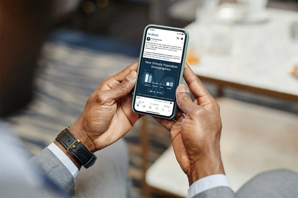
Since 2016, I partnered with The Data Center, a New Orleans-based nonprofit research organization, to help transform complex public policy research into visual stories that could reach broader audiences. Together, we developed a cohesive visual language for their reports, infographics, social media, and advertising that made rigorous data more approachable without sacrificing accuracy or neutrality.
The Data Center publishes in-depth research on issues ranging from housing and disaster recovery to economic opportunity and regional demographics. Although their reports were written to be clear and objective, their length often limited how widely they were read. As more audiences shifted toward digital and social media, the organization needed a way to communicate key findings in formats that were easier to consume while preserving the integrity of the research.
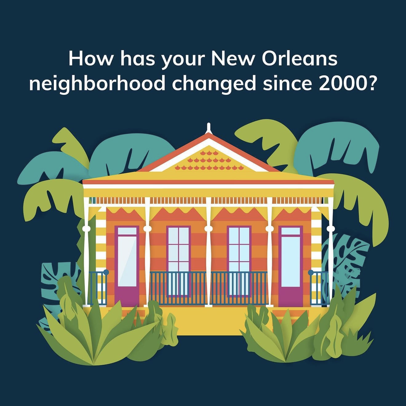
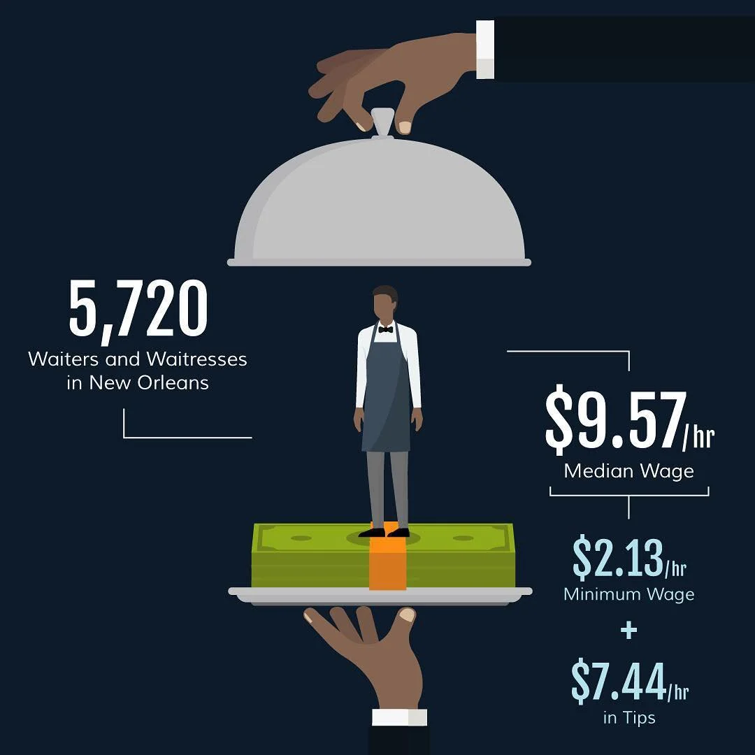
Data Visualizations for Social
Working closely with members of their team and the content team at Online Optimism, I led the translated their brand identity into a visual language for use in social media to transform dense reports into compelling and digestible digital experiences. Rather than simply decorating statistics, I focused on revealing the story within the data by creating infographics, custom charts, motion graphics, and illustrations that highlighted the most meaningful insights. Over time, this visual language expanded beyond social media into digital advertising campaigns, collateral, and other outreach materials.
Prosperity Index
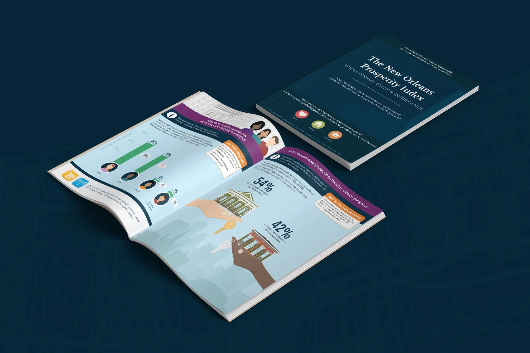
One of the most rewarding projects was leading the design of the Prosperity Index booklet for New Orleans' tricentennial. The publication examined whether Black New Orleanians had experienced greater economic inclusion since the end of the Civil Rights era, combining editorial design, narrative structure, and data visualization to communicate decades of research in an engaging and accessible format.
Digestible Stats
Beyond flagship publications, I helped establish an ongoing communications program that extended the life of every report. Each week, my team distilled newly published research into concise social media content supported by custom visualizations designed specifically for LinkedIn, Facebook, Instagram, and Twitter. Monthly paid campaigns further expanded the reach of these findings, directing audiences back to the full research while increasing awareness among policymakers, journalists, nonprofit leaders, and community stakeholders.
Over more than six years, this approach helped transform how The Data Center shared its work, moving beyond static reports to a cohesive visual communications strategy that made research more discoverable, engaging, and actionable.
Results
social media results 2016-202216.17 million
Impressions184.47 K
EngagementsLink Clicks142.32 K
3K
Report Downloads93K
Website sessionsCredits
Creative Direction:
JP Madrid
content strategy:
lauren walterdesign and motion graphics:
jp madrid, claire escobedo, additional team members
agency:
online optimism