
Bodyflow Hydration
brand, packaging, and website design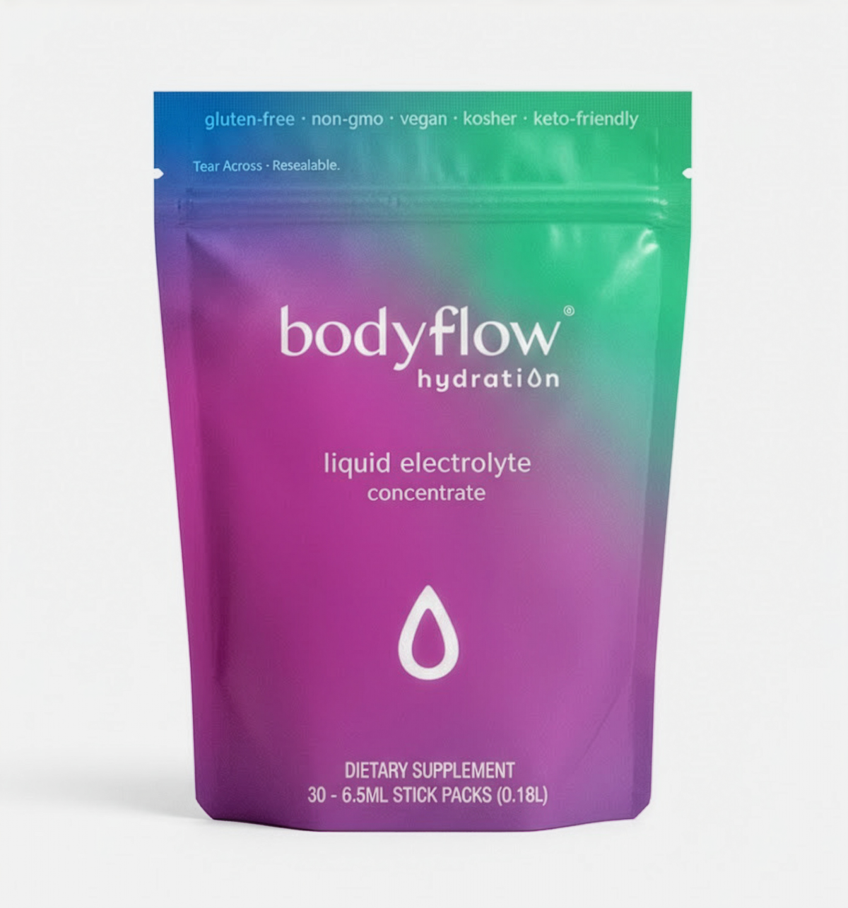
Bodyflow Hydration is a hydration product aimed towards populations that suffer from chronic dehydration, such as lactating mothers or patients taking prescription drugs, and those looking for hydration products without sugar or non-essential additives.
I worked with the founders of Bodyflow Hydration to develop a brand identity, packaging, website, and storefront to introduce this product to the market.
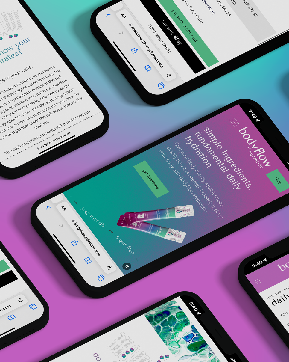
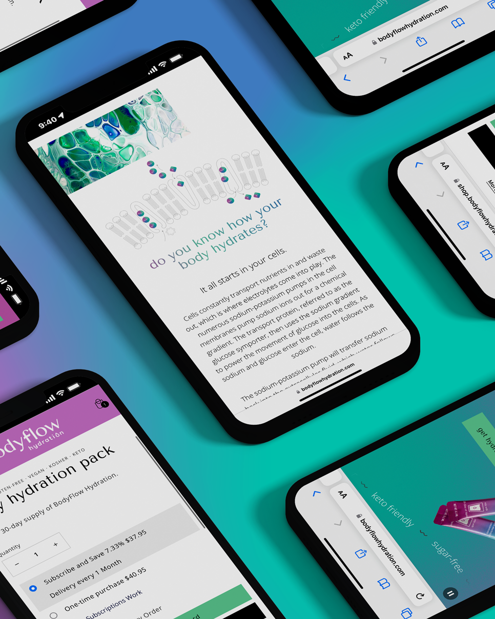
Design inspired in science
Bodyflow’s value proposition is rooted in the biology of cellular hydration: delivering the essential balance of water, sodium, potassium, and glucose that helps the body absorb and use hydration effectively.
The brand identity translates that invisible process into a visual language of soft gradients, fluid forms, and luminous color; evoking osmosis, movement, and biological renewal.
Working alongside a copywriter, I also helped shape content and brand language that carried those same principles throughout the experience. The result is a science-informed yet approachable brand that makes cellular hydration feel clear, restorative, and human.
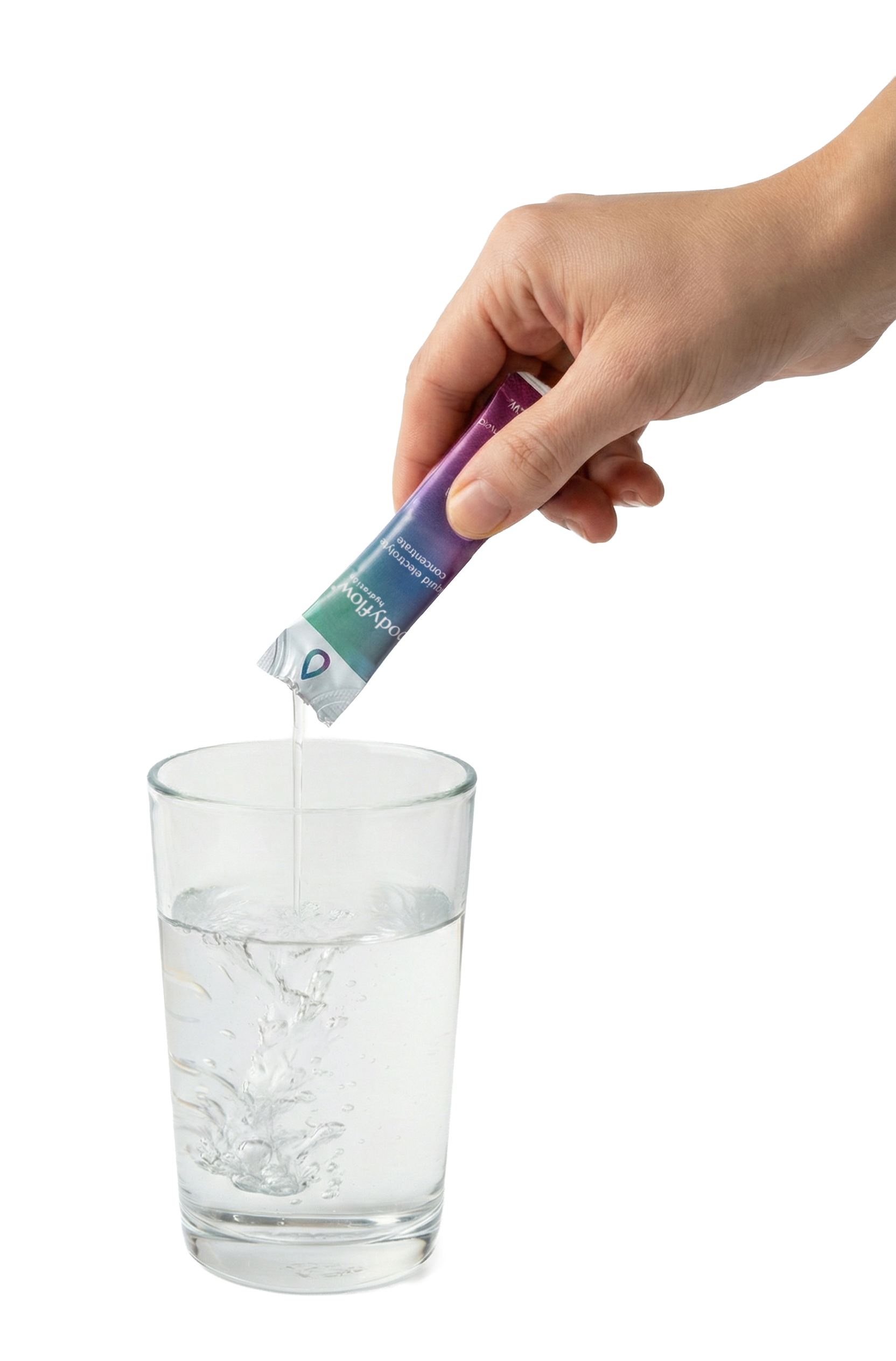
A unique packaging solution
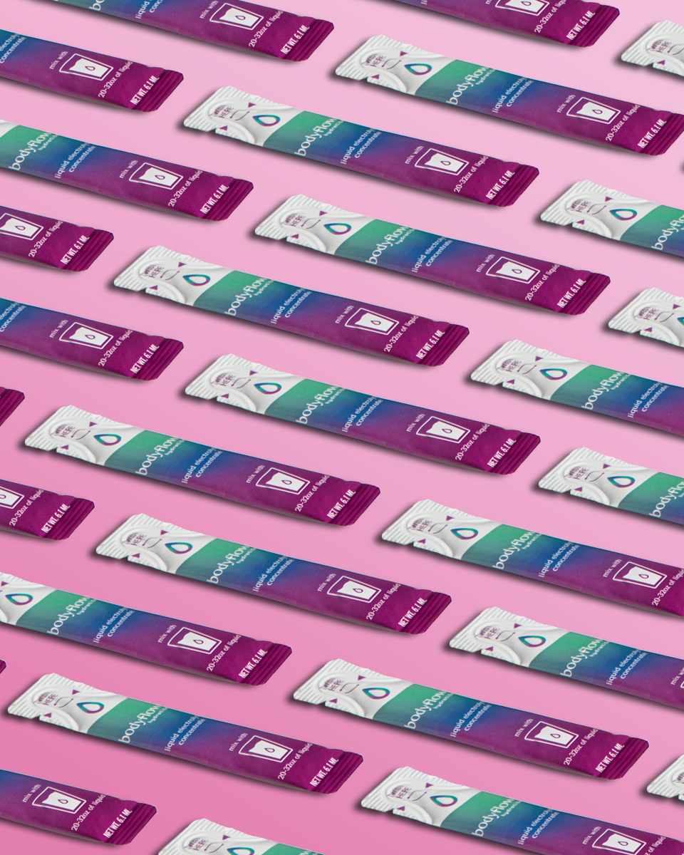
To bring the product to market, I designed Bodyflow’s packaging around a portable liquid stick-pack format. Unlike powdered hydration products, Bodyflow’s liquid formula mixes easily and consistently with water. Working closely with the co-packer, I selected and designed a slim stick pack with a twist-off end, making each serving easy to carry, open, and use wherever hydration is needed.
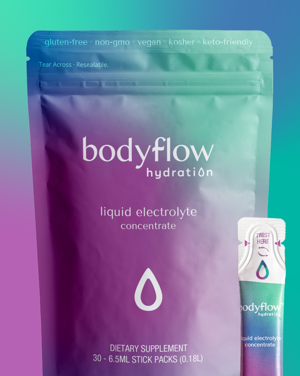
The custom designed pouch contains a month’s supply of cellular hydration.
Credits
Creative Direction and Design:
JP Madrid
Web Development:
JP MadridContent Strategy and Copywriting:
Jordan FigueredoPhotography:
Randy krause schmidt
Awards:
AIGA50, 2023