
Stratus Firm
BRAND IDENTITY DEVELOPMENT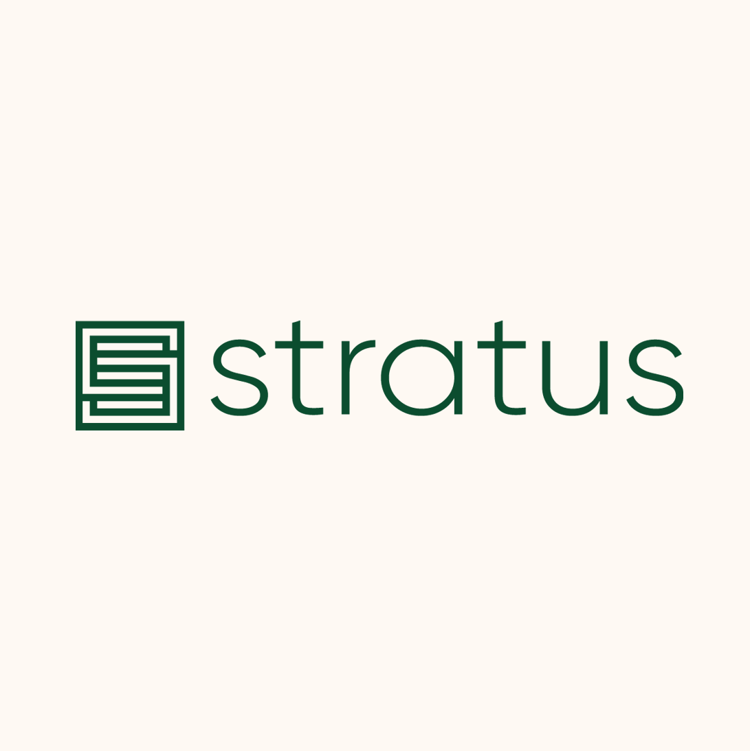
New brand identity
Stratus Firm is a Washington, DC–based event production company known for creating large-scale experiences for prominent organizations.
Formerly RJ Whyte, the company was ready for a name and identity that reflected both its established reputation and its next chapter. The challenge wasn't simply to rename the company, but to transform an established business, from messaging to their visual identity.
Previous logo
Discovery
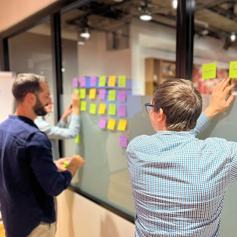
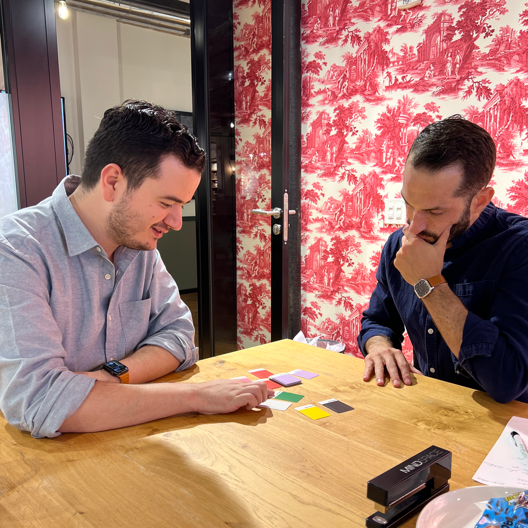
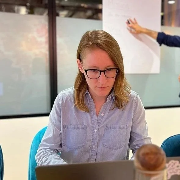
To better understand the business, its evolution, the people behind it, and their vision for the future, my team led a series of workshops with the leadership team to uncover what set the company apart from others in the event production industry.
Through candid conversations about their experiences, alongside a review of customer feedback and existing brand perceptions, we identified recurring themes that would become the foundation for the new brand.
We also invited the team into the creative process through collaborative exercises that explored visual preferences, personality, and aesthetic direction. Those discussions helped establish a shared vision and informed everything from the company's new name to its messaging and visual identity.
A new name and identity
Our team explored dozens of naming directions, evaluating each for meaning, competitive differentiation, linguistic considerations, trademark viability, and domain availability.
The final choice, Stratus, comes from the Latin stratus ("to spread" or "to layer") and evokes both the atmosphere and the idea of reaching new heights. It reflected the company's work producing high-profile conferences, summits, galas, and government events while providing a distinctive identity that could grow with the business.
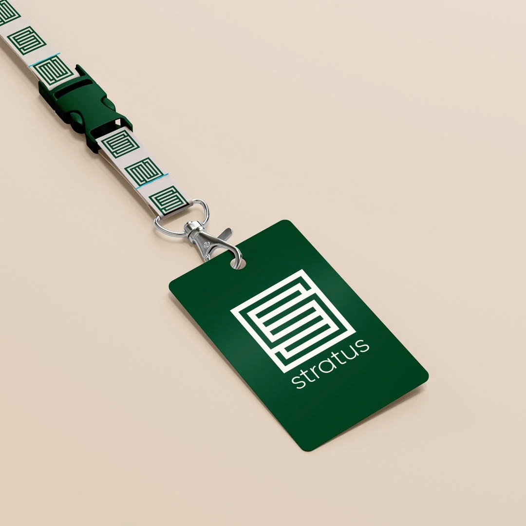
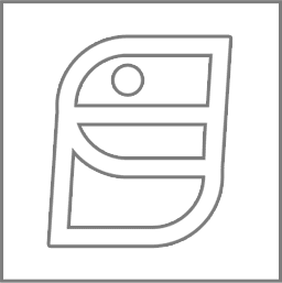
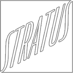
The visual identity centers on a custom symbol inspired by the layered formations of stratus clouds while subtly forming the letter S. The layered geometry reflects the company's ability to bring countless moving parts into a seamless experience, while the clean wordmark creates an identity that feels both established and contemporary.

Symbol Exploration


Credits
Creative Strategy:
JP Madrid and Sam Olmsted
Design:
JP Madrid Supporting Designer:
Claire EscobedoContent Strategy and Copywriting:
Sam Olmsted and Lauren WalterAgency:
Online OptimismAwards:
AIGA50, 2023