Till Design Do Us Part: Branding My Own Wedding
As a designer, I’ve had my fair share of difficult clients, but I don’t think I’ve ever encountered one more difficult than myself.
I recently tied the knot with my now-wife, Olivia, in my home country of Guatemala. And of course, I took the opportunity to flex my branding skills and do something that felt personal and unique to us. Of course, my taste and choices weren’t the only thing on the table…
The Creative Brief
The challenge: Create a visual identity for a destination wedding in Antigua, Guatemala—one that felt at home among the city’s ruins, cobblestone streets, and old-world romance without defaulting to the quiet minimalism of traditional wedding stationery. We also needed a sub-brand for our welcome party that felt distinct while still complementing the rest of the wedding materials.
The client: My wife and me (although, creatively speaking, it was mostly me arguing with myself).
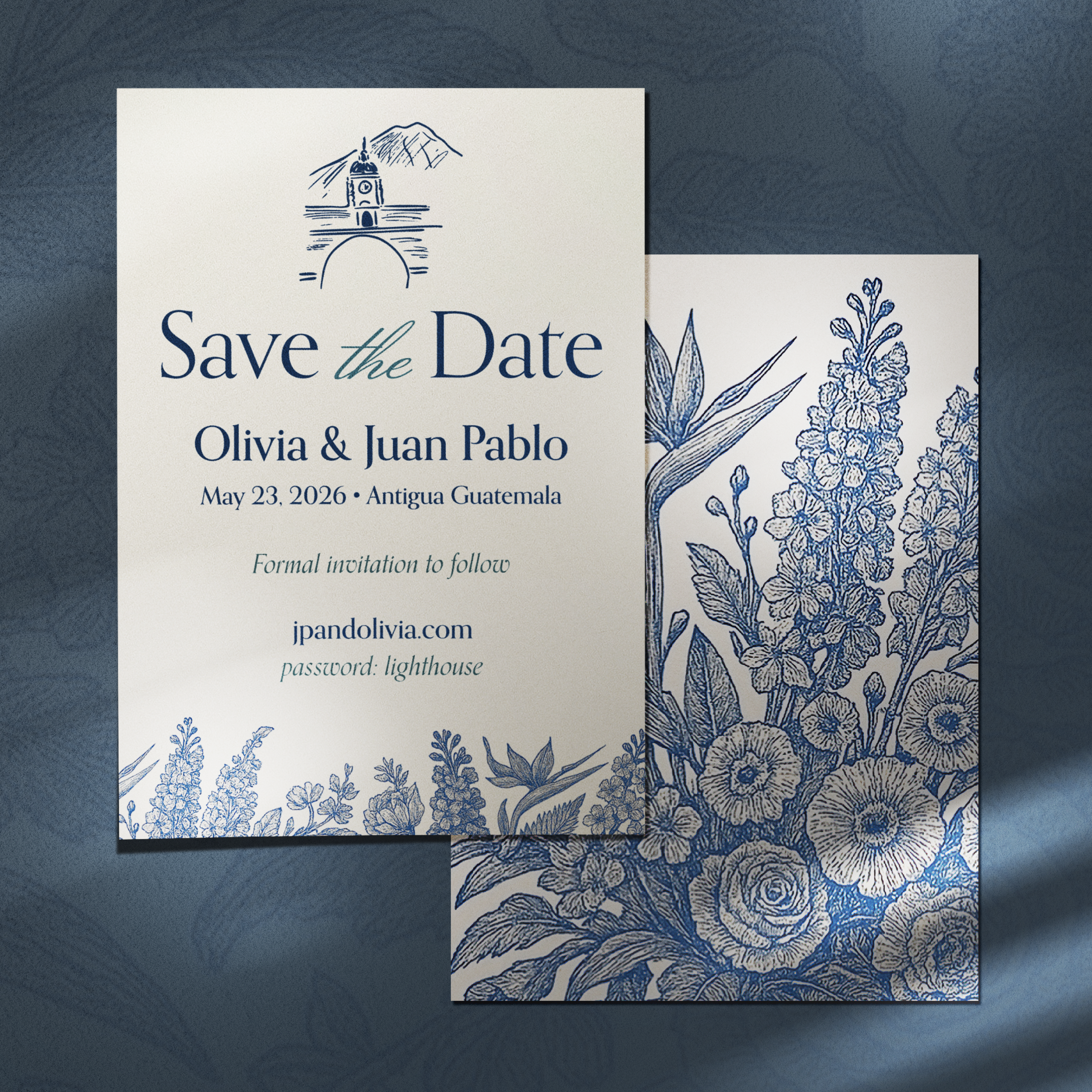
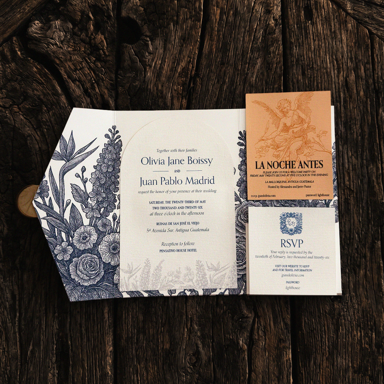
The big idea: Treat the invitations as a sketch of the celebration to come. The stationery would introduce our tropical florals through muted, hand-drawn illustrations. Then, once our guests arrived in Guatemala, that same world would come alive in full color.
The look and feel: Classic, but not stuffy. Whimsical, but still grown-up. Rich in detail and restrained in color, leaving the wedding day itself to provide the brighter pops.
Visual ingredients:
Tropical florals and hand-drawn sketches
A soft, muted palette
Classic typography with playful details
Historic architectural references
Just enough imperfection to feel personal
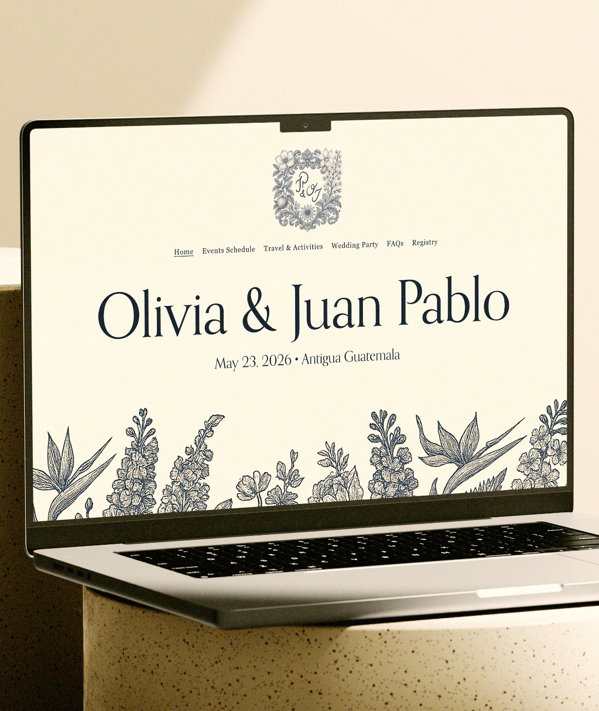
Deliverables: Save-the-dates, invitations, a wedding website, welcome materials, menus, signage, place cards, and every other surface I could reasonably justify designing.
Target audience: Our favorite people, most of whom had no idea they were about to experience a fully art-directed wedding.
Measure of success: Everything feels connected, and at least one guest asks, “Wait, did you design all of this?”
Sketching Our Story
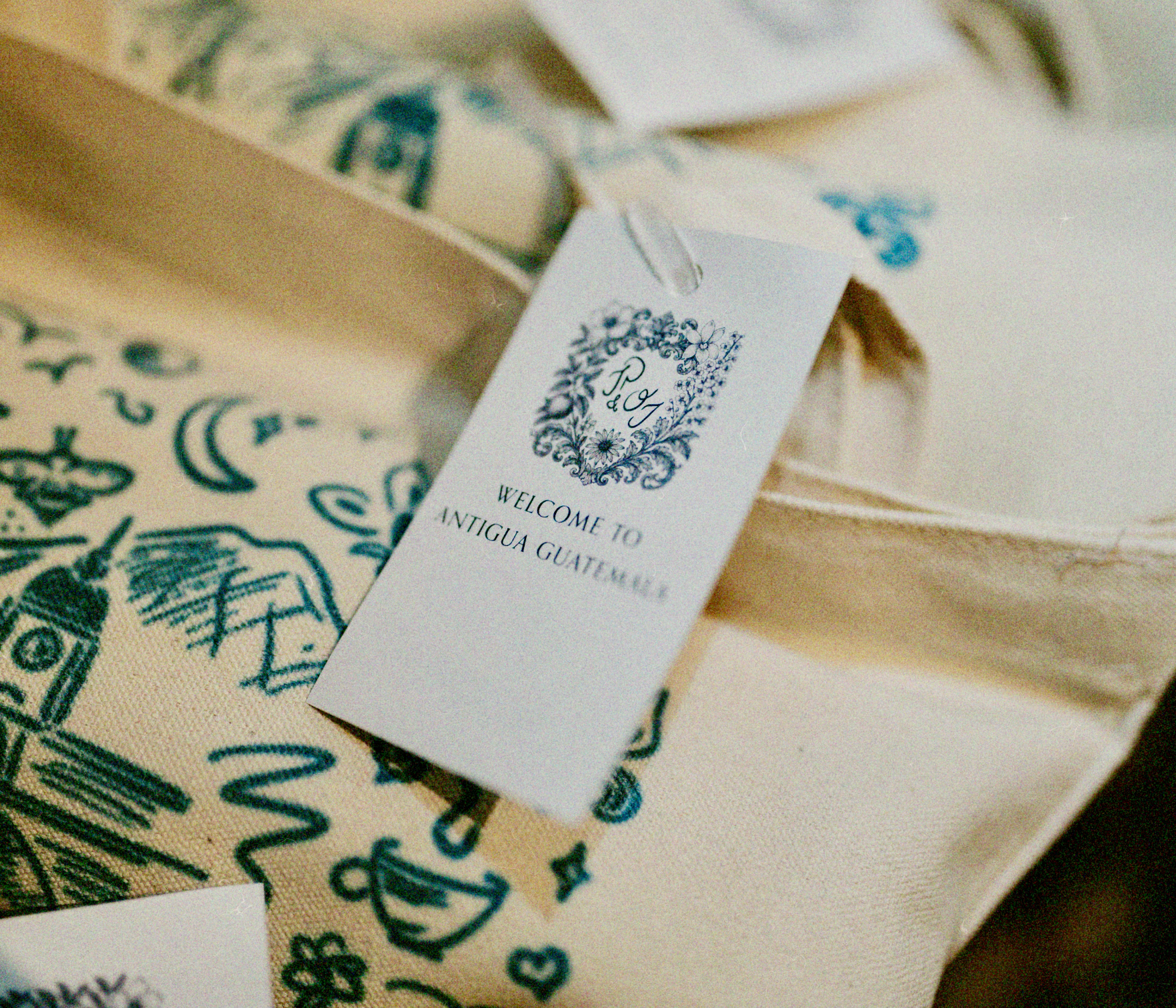
Much of the wedding’s visual direction originated in a collage of sketches I drew while waiting to board a flight after our first planning trip to Guatemala. I wanted to connect our stories through symbols and landmarks representing the people, places, and things that mattered to us: our hometowns, the cities we’ve lived in, our pets, songs we love, activities we enjoy, and much more.
A simple, hand-drawn “JP & OJ” monogram (our initials) became our primary brand mark. It eventually evolved into a crest that brought many of those personal details together.
Engraved-style illustrations of the tropical florals we planned to use at the wedding became a backdrop across the stationery and other materials. I paired them with Orpheus, a typeface that struck the balance between classic and playful that I wanted to carry throughout the identity.

A Proper (on brand) Welcome
We were grateful to have so many friends and family members travel from around the world to celebrate with us, and we wanted to show our appreciation through gifts and keepsakes.
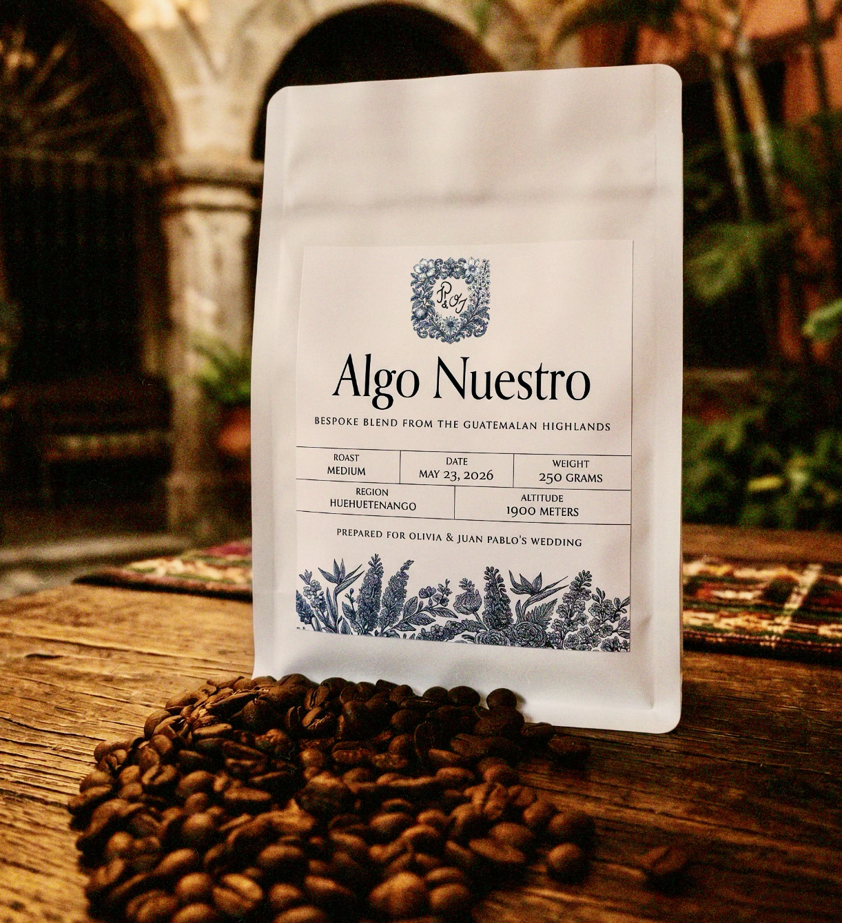
Canvas bags printed with our sketch collage were placed in guests’ hotel rooms and filled with Guatemalan snacks and other goodies. We also collaborated with a family friend who runs a coffee-exporting business to create custom bags featuring our favorite blend.

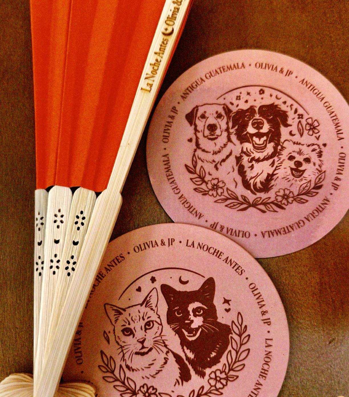
Our welcome cocktail party was held at an open-air restaurant and bar with a warm, rustic atmosphere. For the occasion, I created a wedding sub-brand featuring shades of orange and a new set of hand-drawn elements, including portraits of our furry children, who made an appearance on custom coasters.
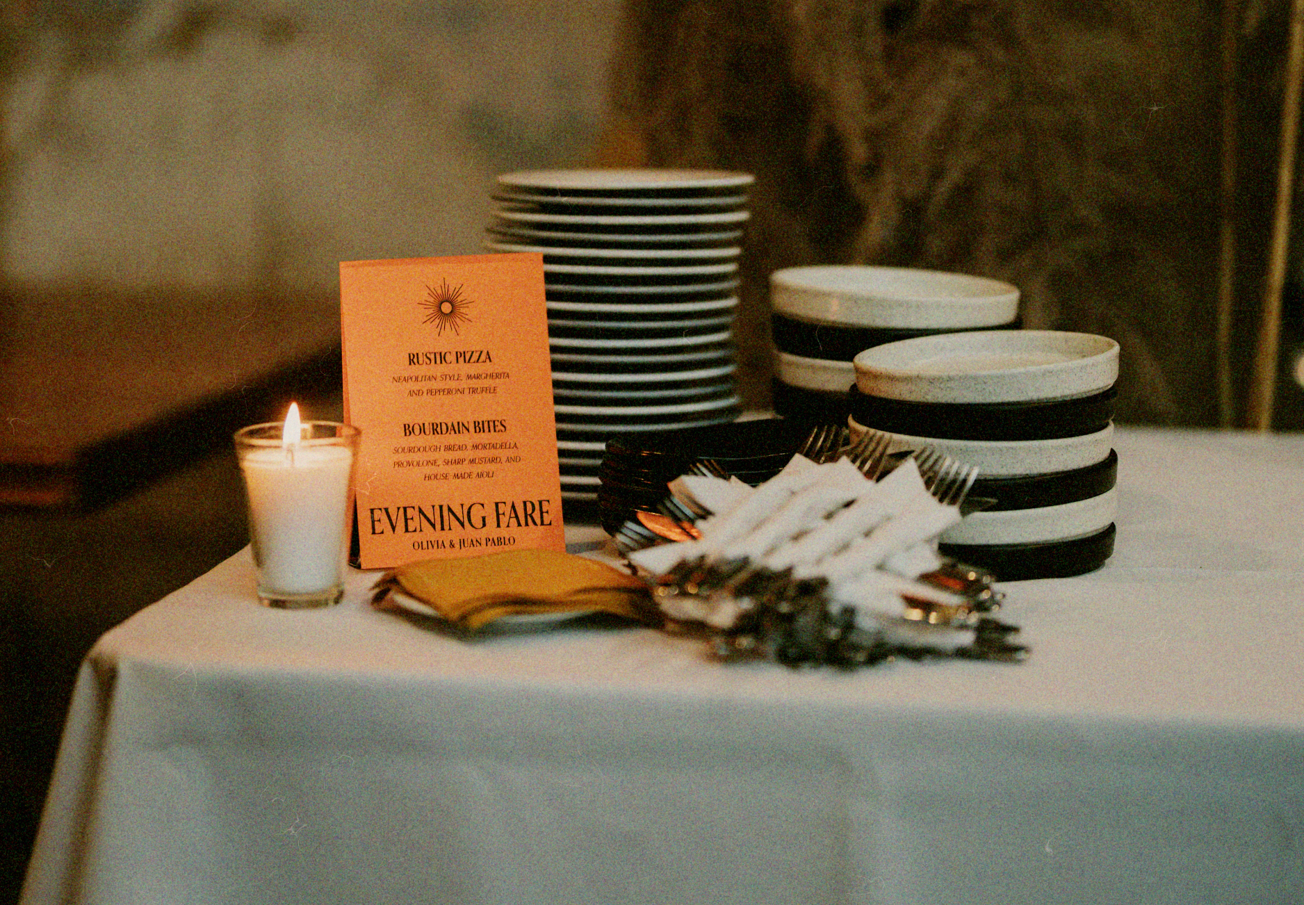
From Mood Board to Matrimony
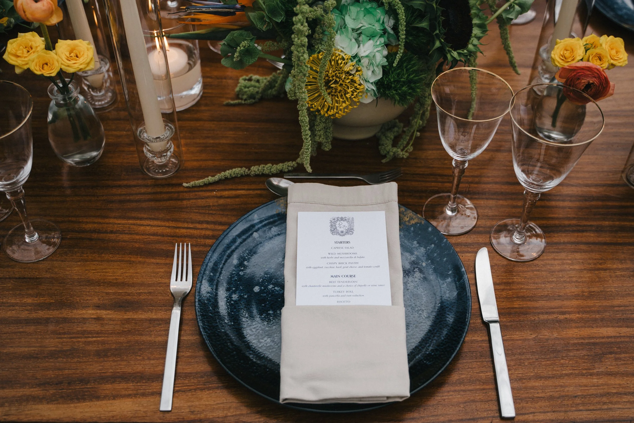
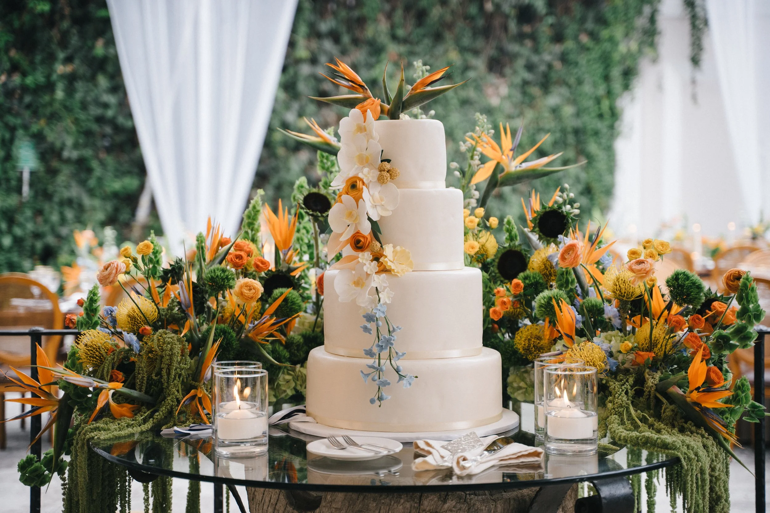
We were lucky to collaborate with vendors who brought the wedding to life in a way that felt authentic to us—and who generously allowed me to be part of their creative processes. It gave me the opportunity to design things I hadn’t explored before: menus, seating charts, welcome signs, a cake, and much more.
The venue’s rustic architecture, the vivid tropical florals, and all the personal details came together to create an atmosphere that felt intentional and unmistakably ours. The quiet, illustrated world introduced through the stationery had finally come to life in full color.
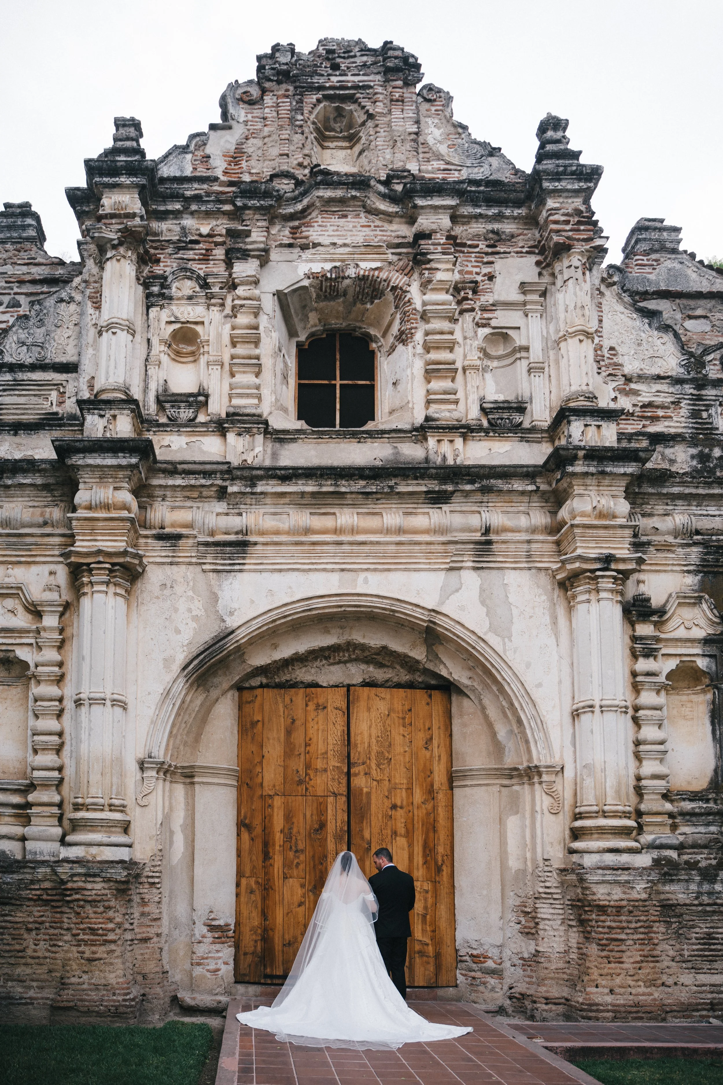
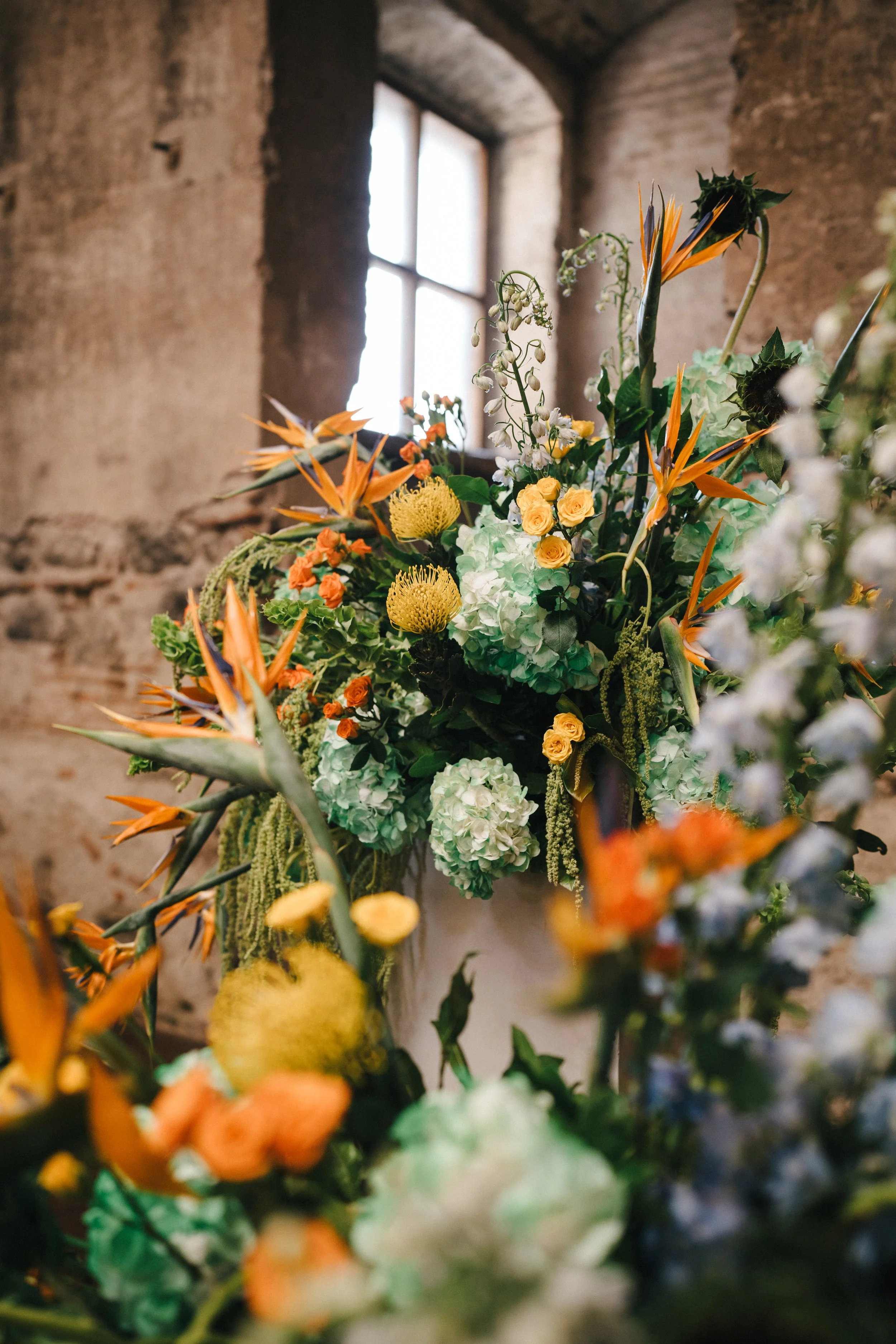
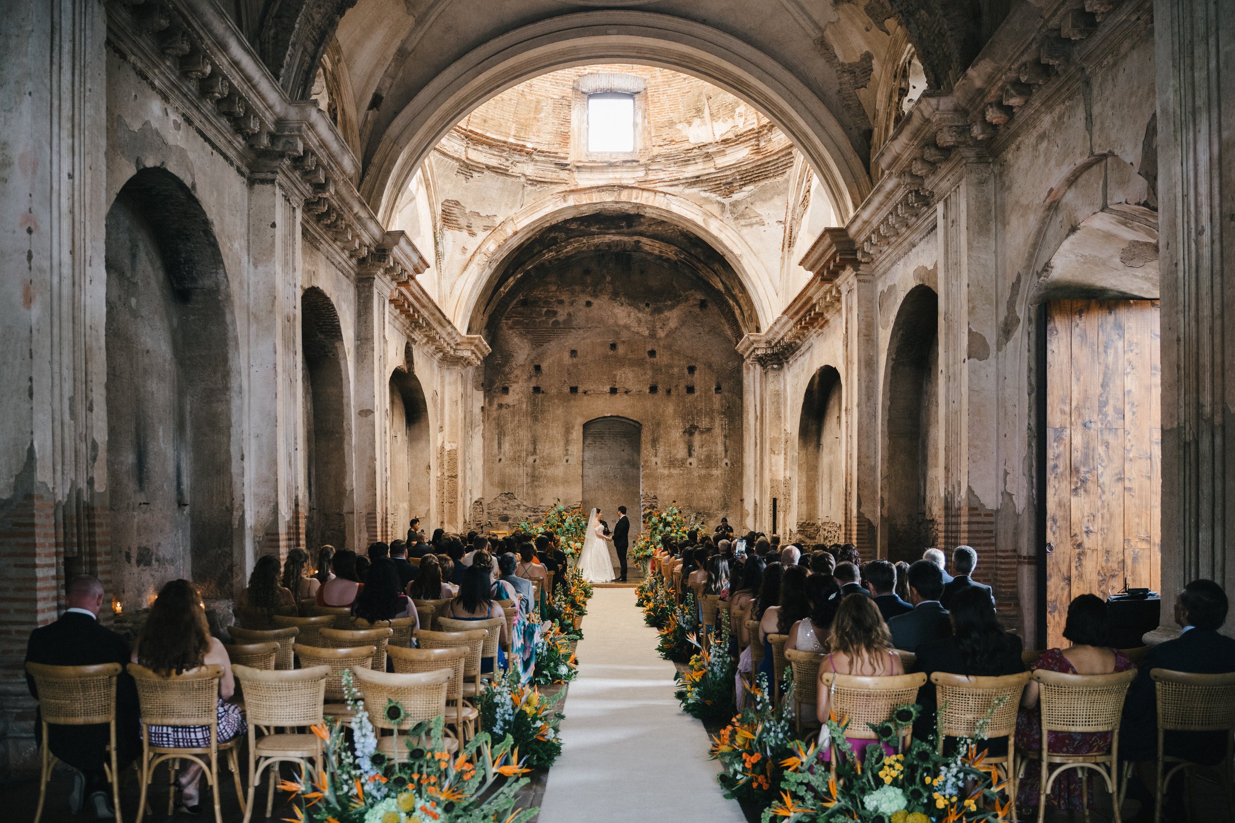
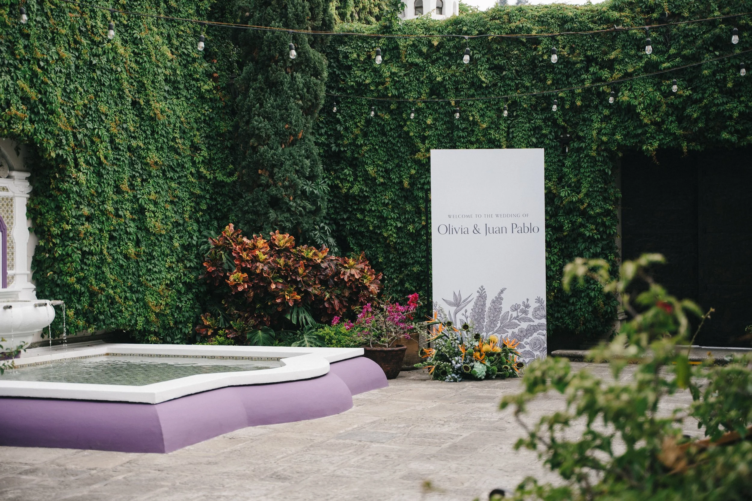
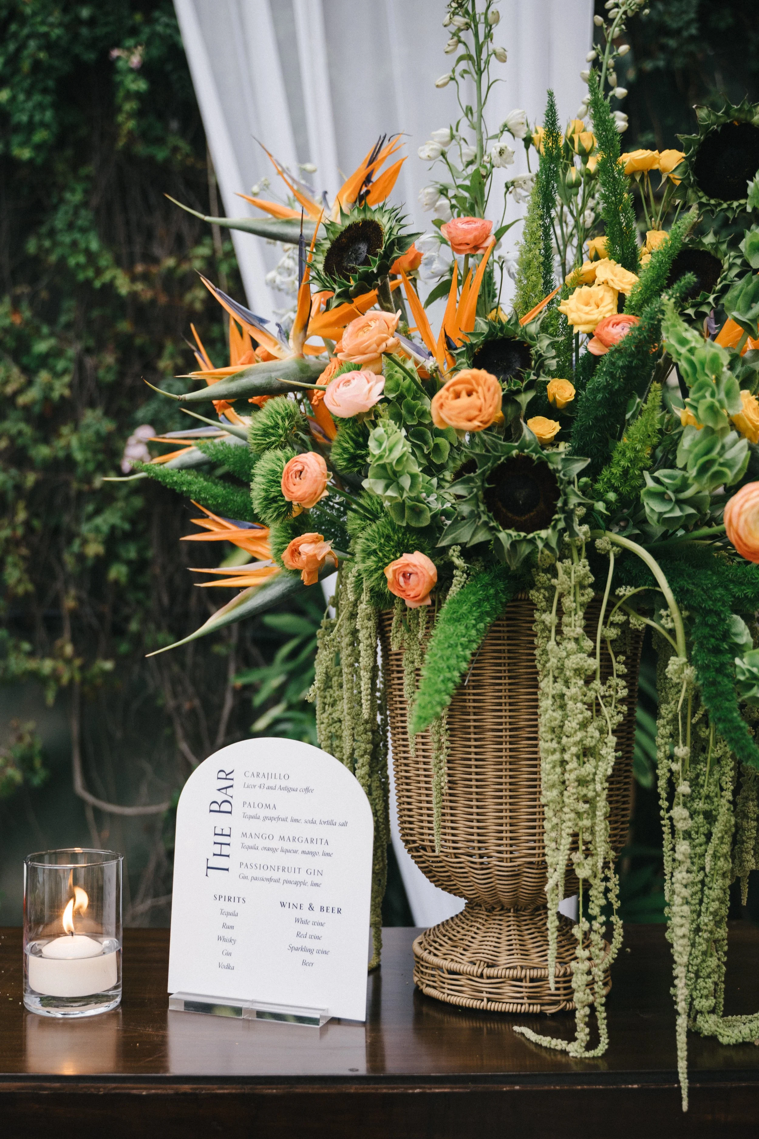
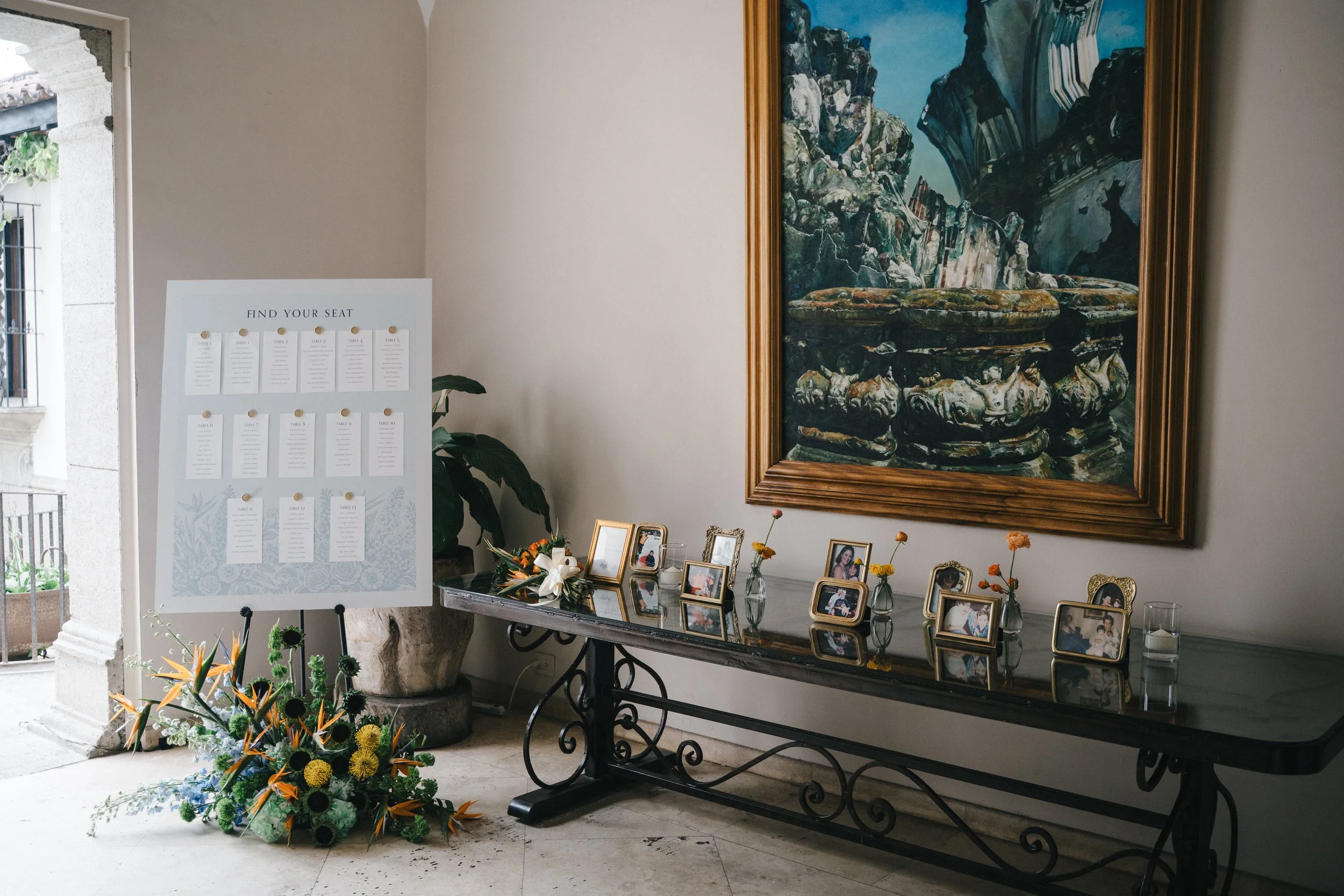
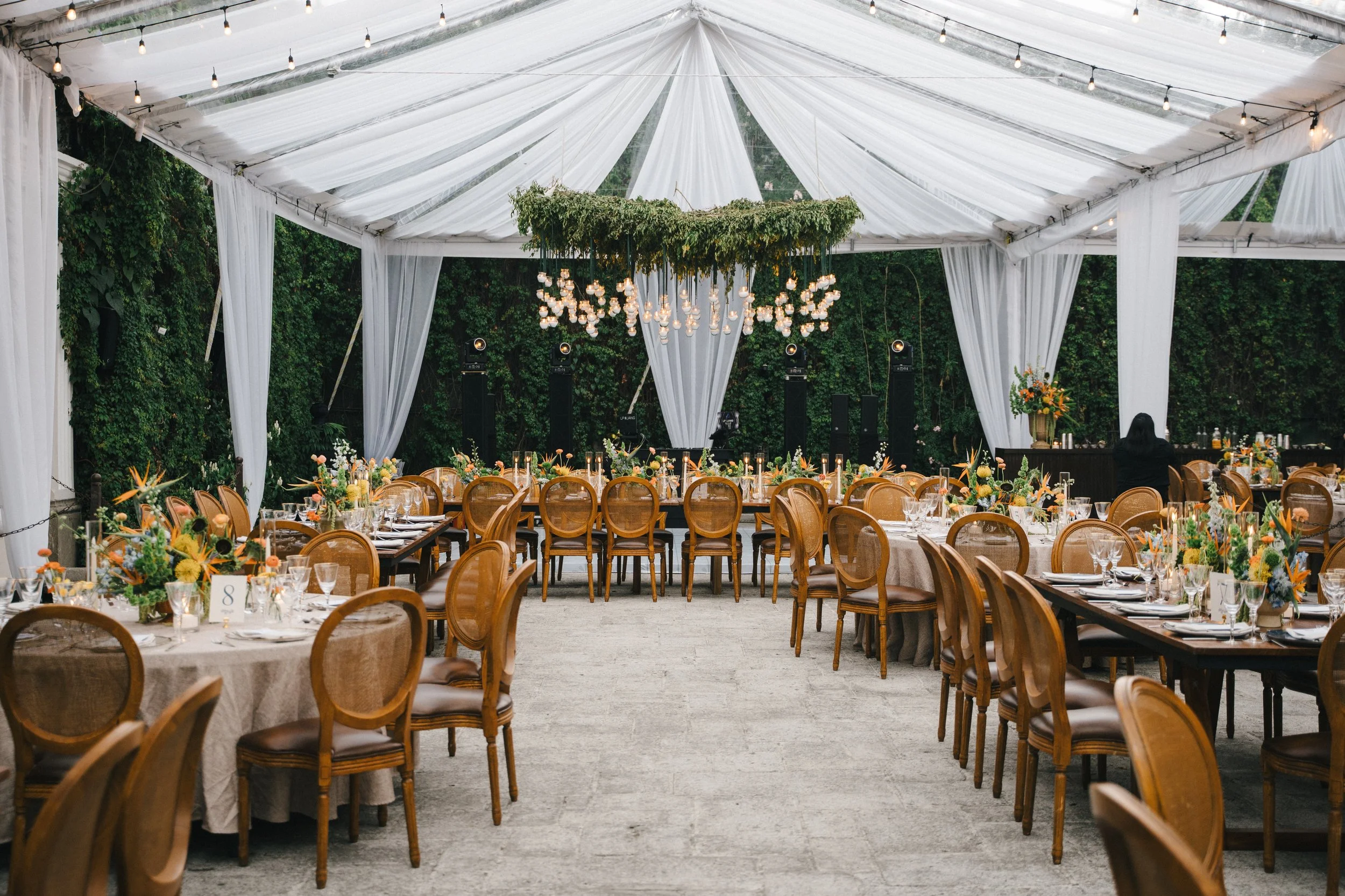
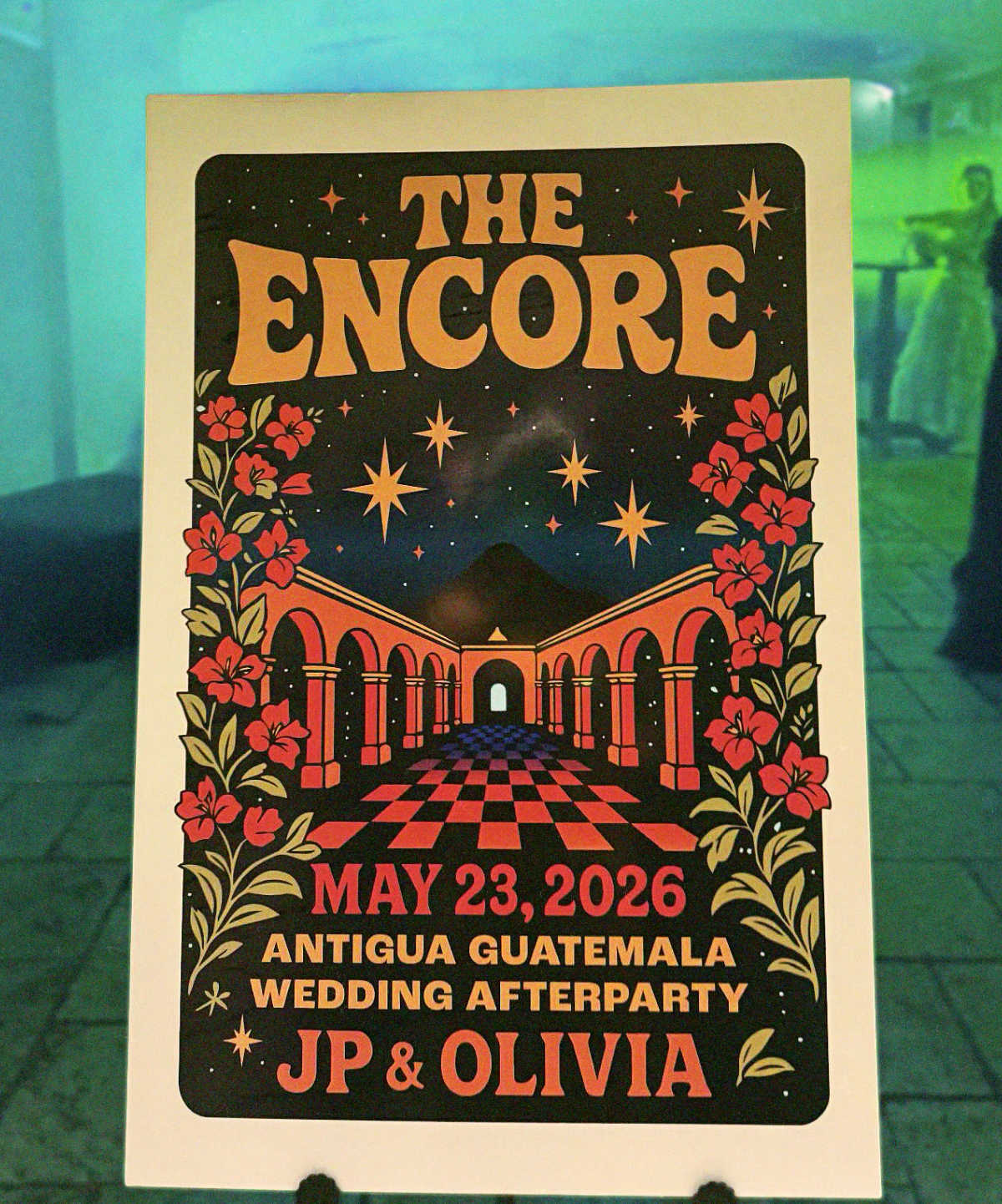
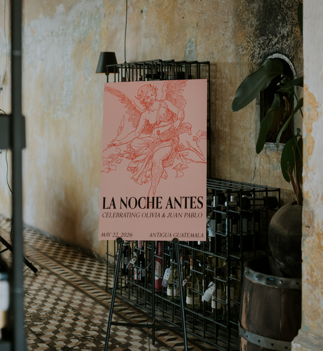
To close out the night, we invited the friends still on the dance floor to continue celebrating at an after-party in the hotel’s cellar. There, guests were welcomed by a concert-style poster that doubled as a keepsake for everyone to sign.
My initial measure of success may have been hearing someone ask, “Wait, did you design all of this?” But the real feeling of success came from sharing the weekend, and seeing it all come to life, with our favorite people.
Credits
Planner: Carmen Catavi Reyes
Invitation printing: Alegra Paper Love
Florals & venue design: La Magnolia
Reception venue: Pensativo House Hotel
Welcome party venue: Casa Alcazarén
Huge credits go to our family and friends who supported us throughout our planning process and joined us for this incredible weekend.
A huge credit also goes to my wife for her endless patience with me while I debated paper samples, colors, typefaces and everything in between.